Professional monitor calibration for graphic designers is essential when a client's brand lives or dies by a specific Pantone value, because approximation is not an option. PerfectChroma provides this calibration so what you see in Adobe Illustrator, Figma, and InDesign is exactly what prints, presses, and pixels reproduce perfectly.
Designers spend too much time second-guessing colour. Establishing accurate monitor calibration for graphic designers makes your display a reliable reference so you design with certainty from the first pixel.
Set your display to your primary design colour space — sRGB for digital media, Adobe RGB for print. This forms the foundation of monitor calibration for graphic designers, taking under 60 seconds after setup.
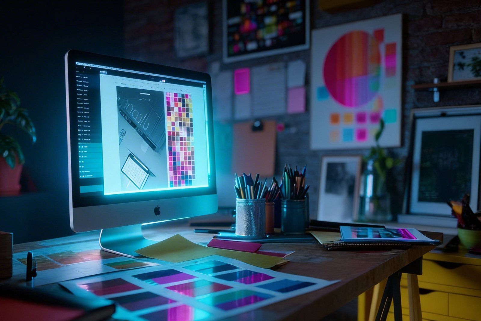
Import a Pantone, HEX, or Lab colour reference file. PerfectChroma maps it to your display's calibrated gamut and shows you the on-screen simulator.
Work in Illustrator, Figma, Affinity Designer, or InDesign knowing every swatch is colour-managed and your display is telling the truth.
Export assets knowing your colour is accurate. Attach a PerfectChroma calibration certificate for client or print-house sign-off.
Skip the back-and-forth with printers and clients. Get colour right on the display and it lands right everywhere else.
Map Pantone spot colors and CMYK process values to your calibrated display's reproduced gamut. Instantly see which brand colors are safely in-gamut and which require a warning flag.
Maintain calibrated presets for digital (sRGB D65), offset print (ISO coated CMYK), and wide-gamut screens (Display P3). Switch between client deliverable contexts in seconds.
Simulate how your design will appear on a customer's uncalibrated sRGB monitor, an offset press, or a large-format inkjet — directly on your calibrated display without exporting.
Sync a shared calibration preset across your entire design team. Every designer's monitor shows the same brand colours — eliminating the "looks different on your screen" problem permanently.
Brand consistency relies entirely on accurate color reproduction across digital and print mediums. When graphic designers and UI/UX professionals work on uncalibrated consumer screens, the hex codes and RGB values they select may look completely different on the client’s devices. PerfectChroma unifies color spaces so that the #FF5733 you choose in Figma, Sketch, or Adobe Illustrator is exactly what your development team implements and your audience sees.
By profiling your exact display, we create an OS-level ICC profile that ensures your design tool's canvas matches the true sRGB or Display P3 standard. This is critical for maintaining the integrity of corporate branding, explaining precisely why proper monitor calibration for graphic designers is mandatory.
Designing for mixed mediums often forces creatives to choose between web vibrancy and print realism. PerfectChroma’s multi-profile switching allows designers to instantly toggle their screen from a D65 sRGB web-design mode to a D50 Adobe RGB print soft-proofing mode. This lets you accurately simulate how your vector graphics and typography will appear after CMYK offset printing.
With integrated Pantone Matching System (PMS) simulation warnings, you are immediately alerted when a chosen color falls outside of your defined gamut. Using true monitor calibration for graphic designers eliminates the friction of endless client revisions and cross-media color discrepancies entirely.
Stop the client correction loop. Calibrate your screen so what you design is exactly what they receive.