
Whether you are grading a feature film, designing a brand identity, or preparing photography for commercial print — every color decision you make depends on one thing: whether your display is telling you the truth. This guide covers the color science basics that every creative professional should understand, from color gamuts and white points to ICC profiles and ΔE accuracy.
1. What Is Color Management?
Color management is the science and practice of ensuring that colors remain visually consistent as an image travels through a workflow — from camera sensor, to editing display, to print, to web browser. Without it, the same image file can look dramatically different on two different screens, or completely wrong when sent to a printer.
The International Color Consortium (ICC) established the technical framework for color management in the 1990s. Their profile format (.icc / .icm) is now the universal standard for describing how a device reproduces color, and is natively supported by every major operating system, print RIP, and creative application.
Color management rests on four pillars: gamut, white point, gamma, and ΔE accuracy. Understanding each one is the foundation of color science basics.
2. Color Gamuts Explained
A color gamut is the range of colors that a specific device — monitor, camera, printer — can capture or reproduce. Not all colors visible to the human eye can be reproduced by any single device, so gamuts always represent a subset of human vision.
sRGB
The default gamut for the web, Windows, and most consumer displays. Covers approximately 35% of visible colors. If you're delivering content for screens, sRGB is usually the target.
Adobe RGB (1998)
Covers approximately 50% of visible colors. Wider than sRGB, particularly in greens and cyans. Standard for professional photography destined for commercial print.
DCI-P3
The standard for digital cinema and modern wide-gamut consumer displays. Roughly 45% of visible colors — significantly wider than sRGB in reds and yellows. Required for Netflix and Apple ProRes HDR delivery.
Rec. 2020
The ITU-R BT.2020 gamut for UHD and HDR broadcast. Covers approximately 76% of visible colors. Most current displays cannot fully cover it, but it's the mastering target for future-proof HDR content.
A critical color science basics concept: sending wide-gamut data to a narrower display without proper gamut mapping causes oversaturation. The color management system (CMS) in Photoshop, Lightroom, and DaVinci Resolve handles this conversion using your display's ICC profile — which is why an accurate profile is non-negotiable.
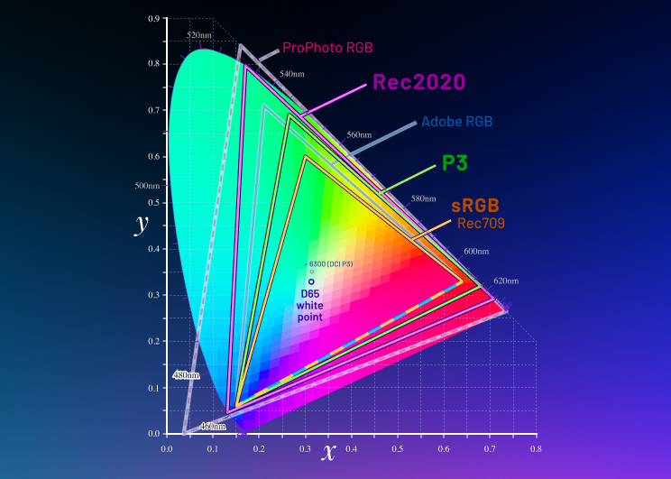
CIE 1931 chromaticity diagram showing major industry color gamuts relative to the full range of human vision.
3. White Point & Luminance
The white point is the color temperature of "pure white" on your display, measured in Kelvin (K). It determines the overall cast of the image — a cooler white point (6500K, or D65) makes the display appear slightly blue, while a warmer point (5000K, D50) appears more yellow-orange.
- D65 (6500K): The standard for video production, web design, and sRGB. Used by Netflix, Apple, and virtually all consumer electronics.
- D55 (5500K): Often used for photography destined for daylight-balanced printing.
- D50 (5000K): The prepress and print industry standard. Matches viewing conditions under controlled artificial daylight in a print viewing booth.
Luminance is the peak brightness of the display, measured in candelas per square meter (cd/m², or "nits"). The correct luminance target depends entirely on your output medium:
- SDR video mastering: 100 cd/m²
- Photography and print soft-proofing: 80–120 cd/m²
- HDR mastering: 1000–4000 cd/m² (requires specialist HDR reference monitor)
Mismatched luminance is one of the most common calibration errors. A display calibrated at 200 cd/m² for video work will look completely different from one calibrated at 100 cd/m², even if both are on the same color target.
4. Gamma & Tone Response
Gamma describes how a monitor maps digital code values (0–255 in 8-bit) to light output. A gamma of 2.2 means the relationship between input and output is a power function — shadows are compressed, highlights expand. This encoding was originally designed to compensate for CRT phosphor characteristics but remains the standard today because it broadly matches the perceptual sensitivity of human vision.
Gamma 2.2 — sRGB, photography, graphic design, web
Gamma 2.4 — PAL/broadcast SDR (EBU R 103-R)
Rec.1886 — Cinema-grade broadcast SDR (complex curve)
ST 2084 (PQ) — HDR10 and Dolby Vision mastering
HLG (Hybrid Log-Gamma) — Broadcast HDR (BBC/NHK standard)
Calibrating gamma incorrectly shifts shadow and highlight detail. A display running at gamma 1.8 instead of 2.2 will look washed out and flat. A display at gamma 2.6 will look too dark and contrasty. These errors are invisible until you compare your final output to a reference — which is exactly what ΔE verification catches.
5. Delta-E (ΔE) — Measuring Color Accuracy
Delta-E (ΔE) is a metric for measuring the perceptual difference between two colors. In monitor calibration, it quantifies the gap between the color your computer sends to the display and the color the display actually produces. The formula is calculated in the CIELAB perceptual color space to ensure that equal numerical differences correspond to equal perceived differences.
The current industry-standard formula is CIEDE2000 (ΔE2000), which improves on earlier ΔE94 and ΔE76 by adding perceptual corrections for blue, lightness-chroma interaction, and hue rotation. PerfectChroma uses ΔE2000 exclusively for all verification measurements.
6. ICC Profiles & 3D LUTs
An ICC profile is a standardized file (.icc or .icm) that mathematically describes how a device reproduces color relative to an absolute, device-independent color space (typically CIELAB or CIEXYZ). When your OS or application applies your display's ICC profile, it compensates for your monitor's specific gamut, white point, and tone response — making your display appear to reproduce color accurately.
A 3D Look-Up Table (3D LUT) is a more powerful correction tool: a three-dimensional grid of input-to-output color mappings that can correct complex, non-linear color errors that simple ICC profiles cannot. Professional calibration software like PerfectChroma generates per-panel 3D LUTs from spectral measurement data, loading them into your GPU's hardware LUT to apply corrections at the signal level — before the ICC profile even processes the image.
ICC Profile
Applied by the OS/application. Describes the display's color characteristics. Supported universally across Photoshop, Lightroom, DaVinci Resolve, and all color-managed applications.
3D LUT (Hardware)
Loaded into the GPU's video output LUT. More powerful correction, handles complex non-linearities. Works at the hardware level — corrections apply to everything displayed, not just color-managed apps.
7. Major Color Spaces at a Glance
| Color Space | White Point | Gamma / TRC | Primary Use |
|---|---|---|---|
| sRGB IEC 61966-2-1 | D65 (6500K) | ~2.2 (piecewise) | Web, consumer displays, photography |
| Adobe RGB (1998) | D65 (6500K) | 2.2 | Commercial print photography |
| DCI-P3 | DCI White (~6300K) | 2.6 | Digital cinema |
| Display P3 | D65 (6500K) | sRGB TRC | Apple devices, HDR consumer content |
| Rec. 709 | D65 (6500K) | Rec.1886 | HD broadcast, streaming SDR |
| Rec. 2020 | D65 (6500K) | ST 2084 / HLG | UHD / HDR broadcast mastering |
| FOGRA39 | D50 (5000K) | 2.2 | European offset print (coated paper) |
8. Soft-Proofing Explained
Soft-proofing is the process of simulating how an image will look in a different color space or on a different output device — entirely on-screen. It works by applying two ICC profiles simultaneously: your display profile (to correct for your monitor's characteristics) and the output profile (to simulate the target device's gamut and tone response).
For a photographer preparing a Giclée print, soft-proofing means loading the paper manufacturer's ICC profile into Photoshop's proof setup and enabling "Simulate Paper Color." What you see on screen should closely predict the printed result — provided your display is correctly calibrated to D50 white point and 120 cd/m² luminance.
For video colorists, soft-proofing means simulating how an HDR grade will look when down-converted to SDR for broadcast delivery. This requires the display to be calibrated to Rec. 709 (for the SDR simulation) while the mastering monitor shows the HDR version.
Soft-proofing only works accurately when your display's ICC profile is precise. An uncalibrated display introduces a systematic bias that cascades through every soft-proofing decision — making every print estimate or delivery simulation fundamentally untrustworthy.
9. Calibration vs. Profiling — What's the Difference?
These two terms are often confused, but they describe distinct steps in the display accuracy workflow:
- Calibration adjusts the display's hardware settings (luminance, white point, contrast ratio) to match target values as closely as possible using the monitor's OSD controls or hardware LUT. It physically brings the display closer to the target state.
- Profiling measures the display's actual color characteristics after calibration and encodes the residual error into an ICC profile. The profile corrects what calibration couldn't achieve in hardware — applied in software by the OS or application.
Professional calibration always involves both steps. PerfectChroma performs hardware calibration (via the connected colorimeter and display DDC/CI interface) followed by a precision profiling pass, then verifies the combined result with a 100-patch ΔE measurement.
10. Applying the Fundamentals with PerfectChroma
Understanding color science basics is the first step. Applying them consistently is what separates guesswork from professional-grade color accuracy. PerfectChroma automates the entire workflow — measuring your panel's spectral characteristics, building the correct ICC profile and 3D LUT, verifying accuracy to ΔE < 1.0, and maintaining calibration over time with drift monitoring.
For deeper technical documentation on each calibration workflow, see our Monitor Calibration User Guide. To explore how calibration applies to your specific profession, see our Solutions pages for photographers, videographers, designers, and gamers.
Ready to Apply These Principles?
PerfectChroma puts every concept from this guide into practice automatically — from gamut profiling to ΔE verification — so you can focus entirely on your creative work.